library(tidyverse)
library(USAboundaries)
library(sf)
library(RColorBrewer)
library(leaflet)I’m currently working on a project with the Wilford Woodruff Papers. I am creating an interactive graph that will display the locations mentioned in Wilford’s writings.
In this post, I will be going through my process of joining spatial data. This will get my data ready for creating my graph by getting location points and geometries. I will be using the following packages in R; tidyverse, USAboundaries, sf, RColorBrewer, and leaflet.
County Polygon Data
Spatial joins are based on the intersection between two spatial objects, often points and the polygons. There are many ways we can join objects, which may include specific options like crosses,near, within, touches, etc. These types of joins can all be done within R!
The R package, USAboundaries, contains boundaries for geographical units in the United States. For this project, I will be pulling county data from this package since it contains geometries for every county in the United States.
counties <- us_counties()
counties <- counties[,-9]
counties <- counties %>%
  select(name, namelsad, state_name, geometry) %>%
  rename(county_name = 'namelsad') %>%
  filter(state_name != "District of Columbia" & state_name != "Hawaii" &
           state_name != "Puerto Rico" & state_name != "Alaska")
The code above show how to load the library and the data. The data set, us_counties, contains two columns with the same name which is why I included the line counties <- counties[,-9] so that it will be easier when joining. I also only selected the columns that I will be using and renamed the column namelsad so that it has the same column name as my wrangled data. I also filtered the data to just show states that are in the contiguous United States.
Below is a graph showing the outline of all of the geometries using this data set.
ggplot(counties) +
  geom_sf()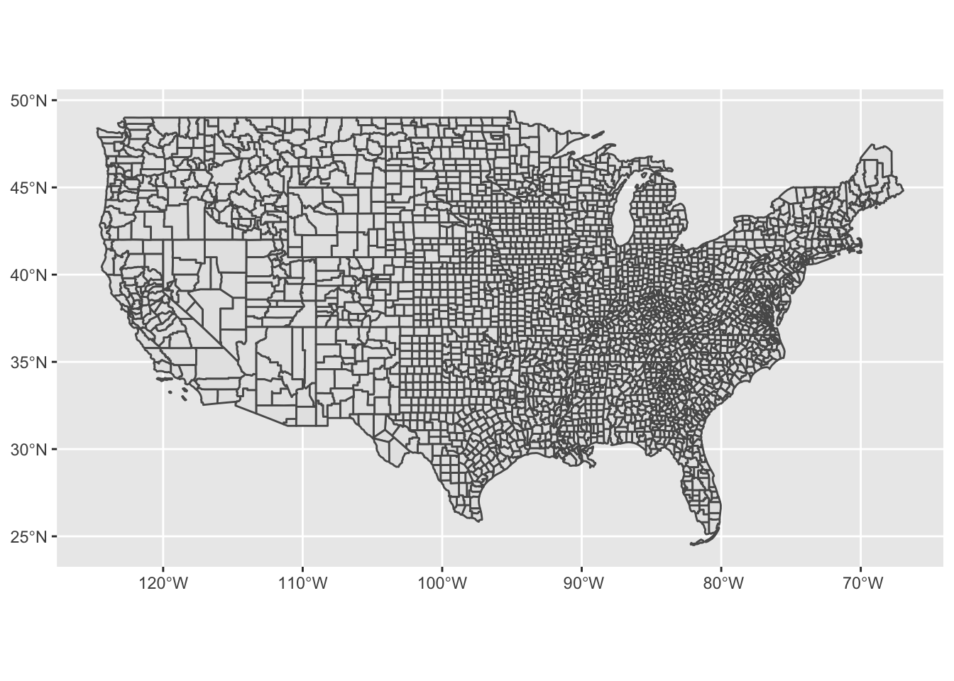
Joining Data
The next step to take is to join our polygon data with the data set I am using for my project.
Previously I have wrangled the data to create separate columns for the cities, counties, and states for every page. I am only creating a graph for locations within the United States, so I also filtered the data to just show those points. The code for this is shown below.
wwp <- read_csv('wwp_data.csv')
location_data <- wwp[!is.na(wwp$Places),]


colnames(location_data) <- c("id", "document_type","parent_id",
                             "parent_name","uuid", "page","website_url",
                             "short_url", "image_url", "original_transcript",
                             "text_transcript", "people", "all_places",
                             "dates", "topics")


location_sep <- location_data %>%
  separate(all_places, "place_first", sep="[|]")


format_data <- location_sep %>%
  mutate(format = grepl("[A-Za-z ]+(,)+[A-Za-z ]+(,)+[A-Z a-z]+$", place_first)) %>%
  subset(format != 'FALSE')


data <- format_data %>%
  separate(place_first, c('city', 'county_name', 'state_name'), sep=',') %>%
  mutate(county_yn = grepl('County', county_name)) %>%
  subset(county_yn) %>%
  select(city, county_name, state_name, parent_name, website_url, short_url, text_transcript)

data$county_name <- trimws(data$county_name, which = c("left"))
data$state_name <- trimws(data$state_name, which = c("left"))

data <- data %>% mutate(state_name = str_remove_all(state_name, " Territory"))

data$county_name <- str_replace(data$county_name, "Great Salt Lake County", "Salt Lake County")
data$city <- str_replace(data$city, "Great Salt Lake City", "Salt Lake City")
To join the data, I will be using a left join by county_name and state_name. It must be joined by both of these since some states have counties with the same names.
I had a lot of problems when joining the data. I tired multiple different ways, but it would always show the geometries as “EMPTY”. After diving a little deeper into the problem, I was able to learn that when I split the original column into separate columns for cities, counties, and states, there was a single space at the beginning of every string, which is what was causing the error. After fixing this, I was able to join the data successfully. Below is the code that I used the join the data and the first five rows of the joined data.
county_data <- data %>% left_join(counties, by = c("county_name", "state_name"))

head(county_data)
# A tibble: 6 × 9
city county_name state_…¹ paren…² websi…³ short…⁴ text_…⁵ name
<chr> <chr> <chr> <chr> <chr> <chr> <chr> <chr>
1 Boston Suffolk County Massach… Letter… https:… https:… "June … Suff…
2 Salt Lake City Salt Lake County Utah Letter… https:… https:… "2\n\n… Salt…
3 Salt Lake City Salt Lake County Utah Letter… https:… https:… "OFFIC… Salt…
4 Salt Lake City Salt Lake County Utah Letter… https:… https:… "Offic… Salt…
5 Smithfield Cache County Utah Letter… https:… https:… "[[Smi… Cache
6 New York City New York County New York Letter… https:… https:… "11\nS… New …
# … with 1 more variable: geometry <MULTIPOLYGON [°]>, and abbreviated variable
# names ¹state_name, ²parent_name, ³website_url, ⁴short_url, ⁵text_transcriptCreating a Graph
Our next step is to use the joined data to create a graph to show counties that are in Wilford Woodruff’s writing. I want to display the count of writings that mention each county. To do this I first create a new column called count that counts how many times the name of a county appears in the data set. After this I also covert the data frame into an sf object so that it will be easier to graph.
group_data <- county_data %>%
  group_by(county_name, state_name)

count_data <- transform(group_data,County_Frequency=ave(seq(nrow(group_data)),county_name,FUN=length))

count_data <- sf::st_as_sf(count_data)
After creating this column, we are now ready to graph our results! I created a leaflet graph that shows an outline of all counties and the color depicts the count of occurrences. The graph I created also includes a pop-up for each county that states the county name and count. This is all shown below.
map <- leaflet(data=count_data)

mybins <- c(0,5,10,50,100,300,Inf)
mypalette <- colorBin(palette="YlGnBu", domain=count_data$County_Frequency, na.color="transparent", bins=mybins)

map %>%
  addTiles() %>%
  addPolygons(smoothFactor = 0.2, fillOpacity = 0.05,
              color = ~mypalette(County_Frequency),
              highlightOptions = highlightOptions(color = "black", weight = 3),
              popup = ~paste(county_name, County_Frequency)) %>%
  addLegend( pal=mypalette, values=~County_Frequency, opacity=0.9, title = "Population (M)", position = "bottomleft" )
City Polygon Data
After joining by county, I had the idea to try joining by city. Since there can be several cities in a county, I thought this could possible be better to visualize the data since there would be more points on the graph.
I found a data set from Kaggle that includes all cities from the United States and their latitude and longitude. I decided to join this with the Wilford Woodruff data to see how it would match up. After joining the data, it seemed like there were several cities that were not listed in the Kaggle data set. I decided to do an anti-join in order to figure what these values were. A few of these are shown below.
cities <- read_csv("uscities.csv") %>%
  select(city, state_name, lat, lng)


city_data <- data %>% anti_join(cities, by = c("city", "state_name"))
city_data[5:10,]
# A tibble: 6 × 7
city county_name state_name parent_name websi…¹ short…² text_…³
<chr> <chr> <chr> <chr> <chr> <chr> <chr>
1 Avon Hartford County Connecticut Letter from Asah… https:… https:… "4\nto…
2 Avon Hartford County Connecticut Letter from Asah… https:… https:… "3\nST…
3 Ashley Uintah County Utah Letter from Asah… https:… https:… "Asahe…
4 Ashley Uintah County Utah Letter from Asah… https:… https:… "[[Abr…
5 Hebron Washington County Utah Letter from John… https:… https:… "[[Heb…
6 Concho Apache County Arizona Letter from Mati… https:… https:… "[[Mar…
# … with abbreviated variable names ¹website_url, ²short_url, ³text_transcriptThe anti-join produced 596 values, which is quite a lot from the data that we have. After looking into these cities, I was able to discover that most of them are small towns, ghost towns, or unincorporated communities, which is why they are not included in the Kaggle data set. Since it would be hard to individually find the latitude and longitude of each of these towns, I decided to stick with using counties since pretty much all of the rows included geometries.
Final Thoughts
Throughout this process of joining spatial data I feel like I was able to learn a lot about the importance of joining and how it can be utilized to create graphs. I think that this information will be very helpful to know in any future project when I am joining spatial data.
I plan on taking the information that I have learned about spatial data and utilizing to to perfect and strengthen my current graph to showcase more information.